Case Study — UX Design, Game Design & Conversion Strategy
One problem. One insight. One outcome that has held for over a decade. This is what it looks like when design works the way people actually think.
 The environment — loud, social, distracted
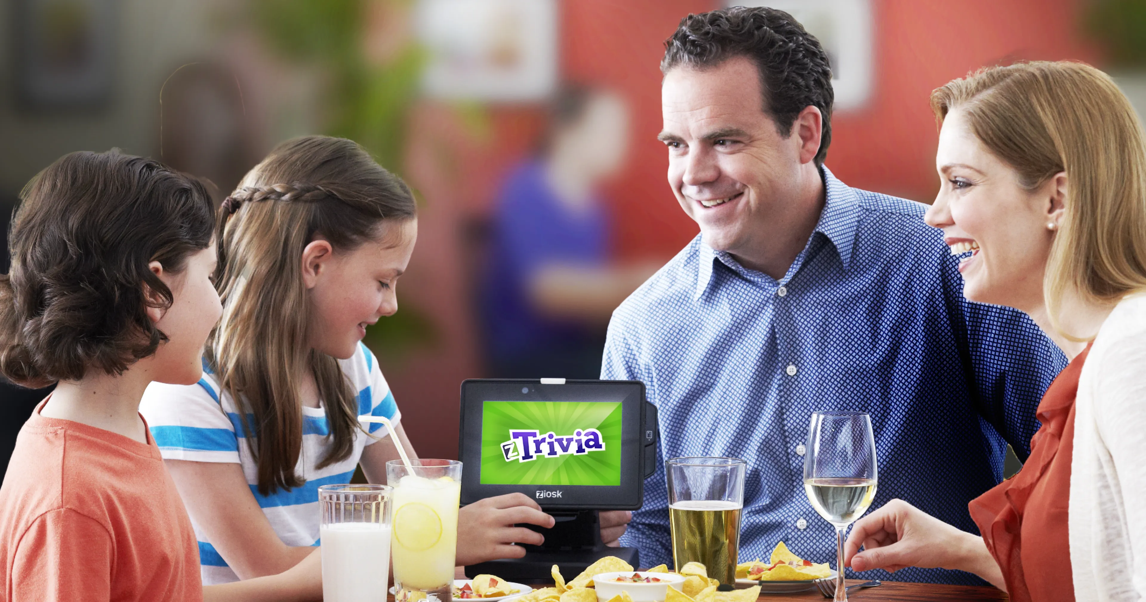
Ziosk had a game called ZTrivia. I had designed it — the mechanics, the question cadence, the communal rhythm of competing across a dining room. It was genuinely good. And nobody was playing it. Over a dozen promotional campaigns had been tested across 187 pilot restaurants. Conversion barely moved. The company was facing bankruptcy.
The failure wasn't the product. It was the assumption behind every promotion: that if you show adults something appealing, they'll engage. But adults in a restaurant are already doing something — talking, unwinding, being present with the people across the table. The device wasn't competing with other games. It was competing with human connection. That is a fight you cannot win with better creative.
The reflex
Adults were turning the device face-down before the promo even loaded. You cannot advertise your way past a physical rejection.
The friction
The existing flow required three deliberate steps before the game launched. In a loud, distracted environment, that's three opportunities to lose someone forever.
The ask
Every previous promo led with price. Pay first, experience later. That is the wrong order for System 1 decision-making — every time.
 The insight — collapse the distance between promotion and experience
Before designing a single screen, I played ZTrivia as someone who had never seen it. That moment changed everything. The game was genuinely worth someone's time and money — it just had no front door that proved it. The problem wasn't the product. The problem was that we were asking people to trust us before we gave them any reason to.
The solution was to collapse the distance between the promotion and the experience entirely. The promo would not advertise the game. The promo would be the game — a live question, a countdown timer, a surprising answer — and only then, a single quiet invitation to keep playing.
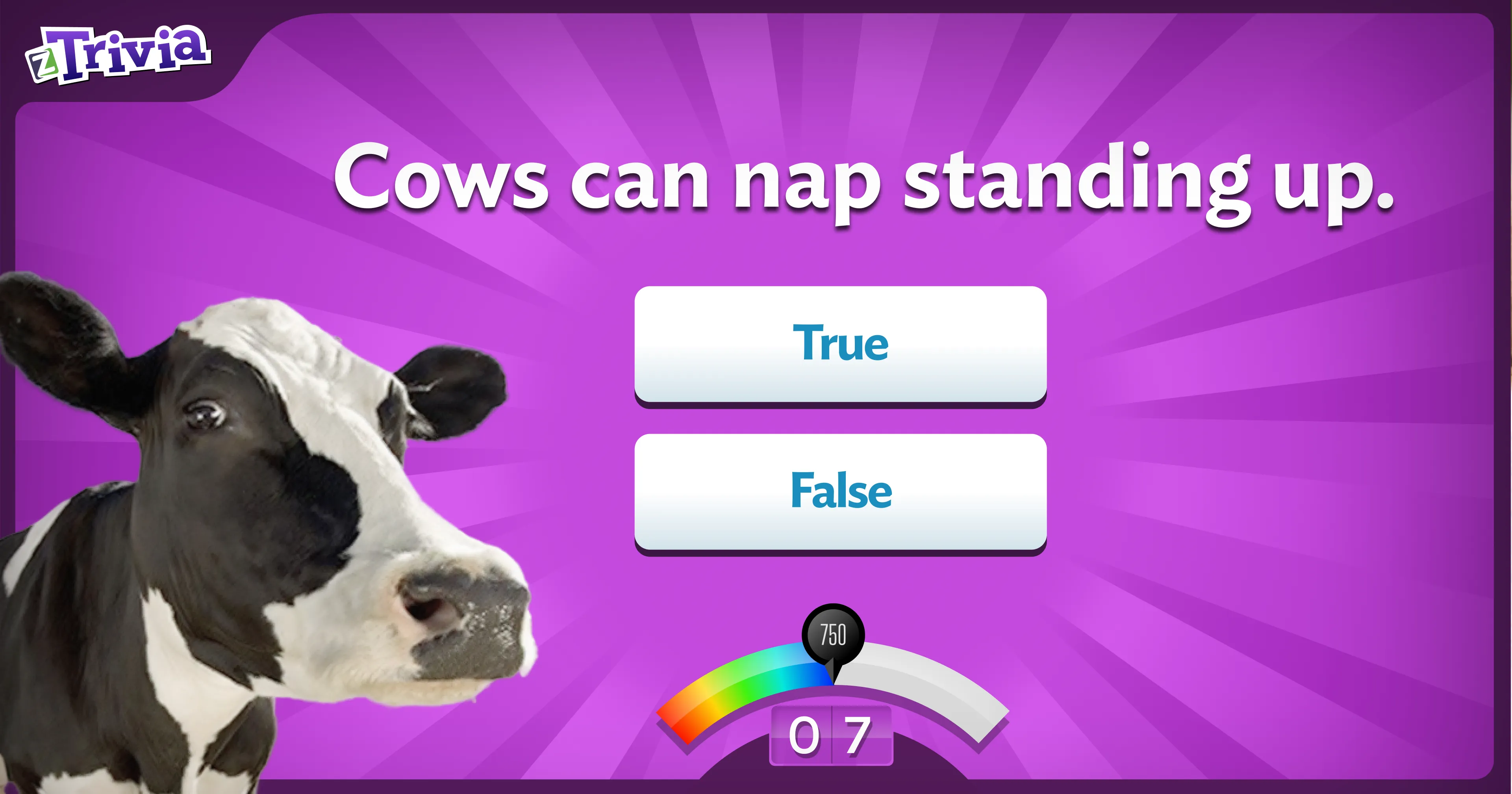
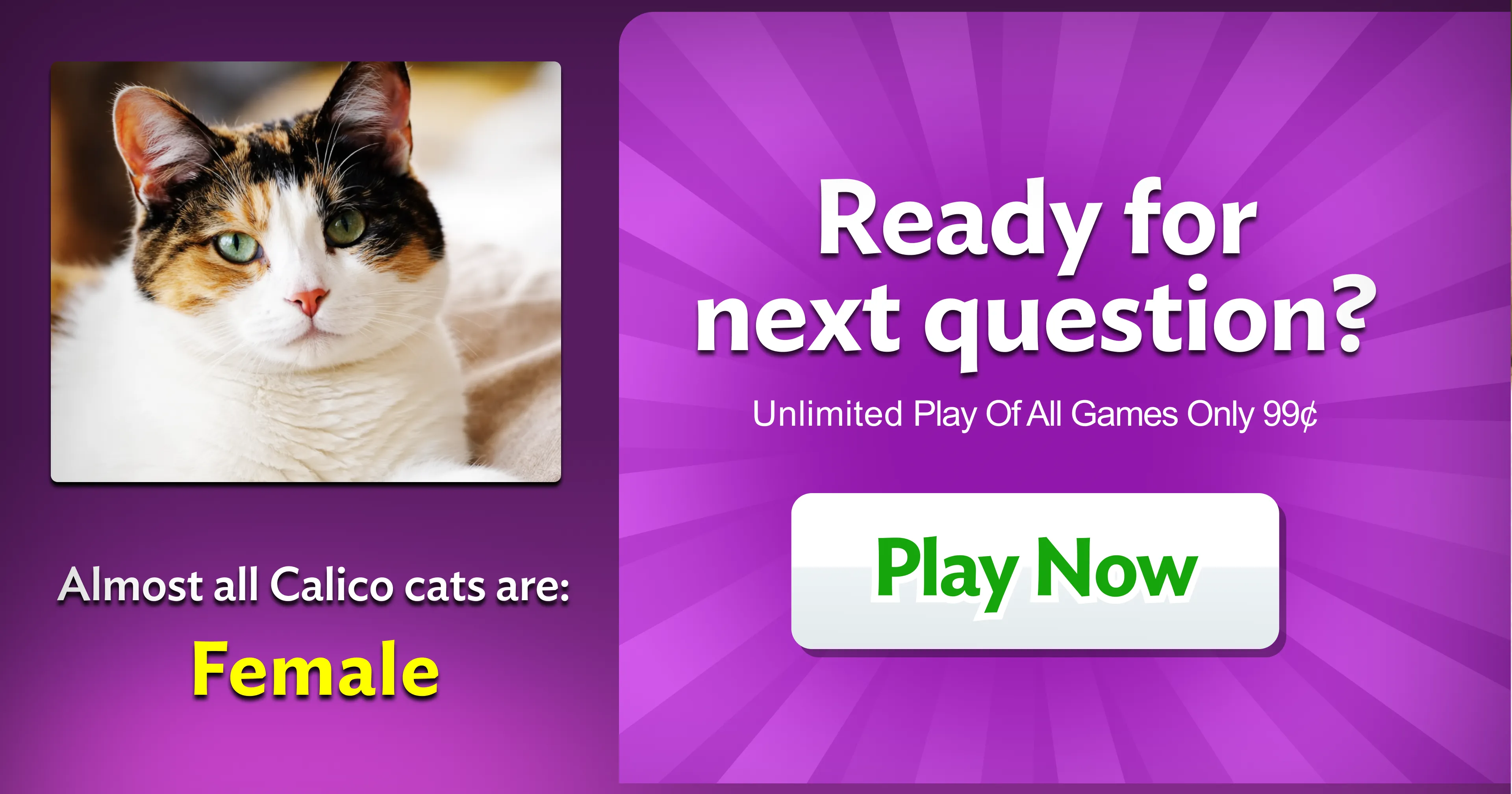
I searched through hundreds of questions — drawn from the same library I had built for ZTrivia — for content with a specific emotional quality: disarming enough to stop a distracted mind, surprising enough to create genuine curiosity. Two questions earned their place. A true/false about a cow. A multiple choice about calico cats. Neither was arbitrary — both carried an image and a reveal that landed emotionally before the brain could decide whether to care.
Four is too many. Two is not enough. Three is the only number that feels complete — the only container the mind accepts without effort. The promo had exactly three moments: a question, an answer, a choice.
Nobody in the building thought it would work. The response when I showed the concept was essentially: "You turned the game into a promo. Okay." That reaction — the absence of excitement from people who had been desperate for a solution — is something I've come to recognize. The ideas that work the first time rarely look impressive before they're deployed. They look obvious. And obvious, it turns out, is exactly right.
Within days of deployment the data was unambiguous. Not a spike — a permanent upward shift in the floor of daily revenue that held without variation from 2013 through COVID. The CMO showed me the chart. It looked like someone had drawn a line and raised the ground.
The CEO called a company-wide meeting shortly after to announce that Ziosk had signed with Chili's, Olive Garden, and Red Robin. A company that had been days from filing for bankruptcy was now in over a thousand restaurants.
Still running — 2025
The Cat and Cow promos have never been beaten. Every iteration over more than a decade produced lower revenue than the originals. As of 2025 they remain in active deployment — identical to the 2013 design. They have outlasted hardware changes, leadership changes, and over a decade of attempts to improve on them. Olive Garden still runs the original wide-format device. They refuse to change it.
The work that lasts isn't the work that looks most impressive in a presentation. It's the work that respects how people actually think — and earns their attention by deserving it.
If you've used a Ziosk device and felt deceived, the frustration behind that experience is legitimate. The public record of complaints is real.
I was the lead designer of the customer-facing experience at Ziosk for the better part of a decade — and the original designer of ZTrivia itself. The game mechanics, question library, communal structure, visual design, promo flows, and conversion strategy described above were mine. What I did not design — and what I flagged when I encountered it — were the monetization dark patterns layered onto the platform by business leadership. Screens engineered to obscure what a user was agreeing to. Language designed to create false impressions about purchases. I reported one such instance directly. I was later informed it had produced a revenue spike. The connection between those two facts is not lost on me.
Good design can be corrupted by bad business decisions. The work I built was grounded in one principle: give people genuine value before asking for anything, and give them a real choice. What happened to parts of that work reflects the values of the people running the business — not the values that drove the design.
I raise this not to distance myself from difficulty, but because silence would be its own dishonesty. The reason I'm proud of Cat and Cow isn't only that it worked — it's that it worked by being honest.